CLIMB Theatre
OVERVIEW
Climb Theatre is a Twin Cities non-profit organization whose mission is to use the power of live theatre to inspire people to actively participate in the bettering of their communities. They aim to inspire and propel people to become their best selves through creativity, collaboration, and building trust.
Problem
Climb is looking to better understand the degree to which its website serves its audiences and ways in which the content and approach could better meet their needs. Currently, they are concerned that the website may be tailored to a limited set of their users, and missing ways to engage with others.
Solution
Working in a team of 5, my goal is to create a better user experience for Climb Theatre’s partners going through the website so they can host and create memorable plays for their audience.
II will achieve this goal by creating an IA Diagram, conduct Usability Interviews, design Wireframes, create a Journey Map with Personas, and build a Findings and Recommendations Report.
SYNOPSIS

(left to right) Grace, Saba, Nicole, Haley, Sara
Client: Climb Theatre
Role: UX Designer & Researcher
-
Research Climb’s Website and structure an IA Diagram to gain key insights and pain point areas.
Write a competitive and content audit.
Conduct Usability Tests with Educators/Facilitators and Administrators who fit with the two key user groups (Players & Payers).
Create Personas and a Journey Map of their experience.
Design wireframes in mid-high fidelity on Climb’s Website
Compile everything in a Findings and Recommendations Report
-
Competitive Analysis
Content Audit
Information Architecture Diagram
Usability Testing
Personas
Journey Mapping
Wireframing
Findings and Recommendations
-
FigJam, Figma, Google Docs, Google Spreadsheet, Zoom, Keynote, Kanban board
THE JOURNEY
Click to scroll down the page and follow my UX journey
-
![]()
1 - IA DIAGRAM
Where are the areas of concern?
-
![]()
2 - COMPETITIVE AND CONTENT AUDITS
Finding what works
-
![]()
3 - USABILITY TESTING & PERSONAS
Is it user friendly?
-
![]()
4 - JOURNEY MAPPING
How the user feels
-
![]()
5 - WIREFRAMING
Visualizing the Future
-
![]()
6 - FINDING AND RECOMMENDATIONS
Steps for the future
-
![]()
CONCLUSION
What I learned/ What’s Next


IA DIAGRAM
Where are the areas of concern?
My Findings
To begin my research, I wanted to investigate their current website and find where users become confused. This helped me structure an I.A. Diagram of the whole site as I navigated through it.
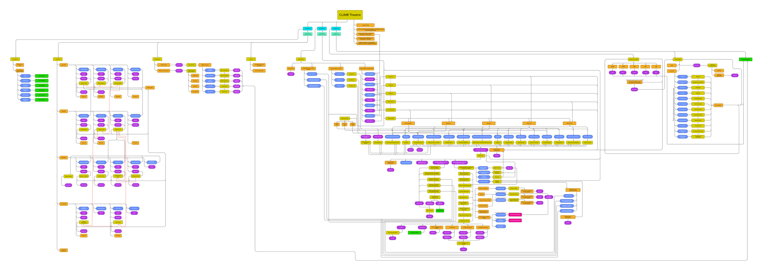
Problem Spaces/Opportunity Areas
Consistency - Coloration, Imagery, Wording, Buttons, and Contact Form need to be standardized.
Hierarchy of Content - restructuring the website’s landing pages to reduce redundancy and prevent the user from getting lost.
Accessibility - Fixing broken or missing links and ensuring the user can quickly access information and resources.
Challenges
The challenges with creating the IA Diagram started when I discovered that the main website was connected to several outside websites. Our scope was to cover their main site (https://climb.org/) but we found at least 4 more additional ones, whose links are spread throughout the main site. In the Diagram, these additional websites are colored in green.
COMPETITIVE AND CONTENT AUDIT
Finding What Works
Competitive Audit
To get a better understanding of the educational theatre space, we performed a competitive audit to find what was working well on other websites, as well as what was not working.
Content Audit
In order to learn about the current state of CLIMB’s website, we went through and did a content audit, which also informed the building of the Information Architecture. We found buttons that were not clearly visible, links that didn’t always take you to the same page, and several other inconsistencies.


USABILITY TESTING & PERSONAS
Is it user friendly?
Methods & Tools
Think-aloud Protocol
30 min — 1 hour Duration
Zoom call or In-Person
Website | Pen | Paper | Laptop
Usability Interview Testing
After conducting our initial research and hypothesizing some pain points with the website, we tested our concerns with 7 users who fit our target audience - Payers and Players. These users are broadly categorized as Educators, Facilitators, and Administrators. As a result of the interviews, while current users love CLIMB’s mission, vision, and values, the path to finding what they are looking for isn’t clear and can sometimes be overwhelming. Our focus moving forward will be to lessen the burden of finding information on the website.
Payers - People who fund for Climb’s services and make the decisions. They consist of Principles, Coordinators, Superintendents, and Corporate Funders.
Players - People who help with Climb’s plays. They look for a meaningful way to improve their students’/audiences’ social and empathetic skills in an engaging way. They consist of Teachers, Counselors, and Non-school or Youth-serving entities.
Personas
Based on our interviews, we devised some personas who represent the main concerns and predicaments that require Climb Theatre’s services.

JOURNEY MAPPING
How the user feels
Findings
With our personas ready, I worked alongside Haley to make a Journey Map to show where teachers and funders either excel or struggle at. Based on our findings, both user groups (payers and players) follow similar paths throughout the entire journey.
However, the user experience dips under the Research phase due to the overwhelming amount of information they are given with little direction take. Therefore, our approach in moving to wireframing will focus on improving both the aesthetics and hierarchy of information to improve accessibility.
WIREFRAMING
Visualizing the Future
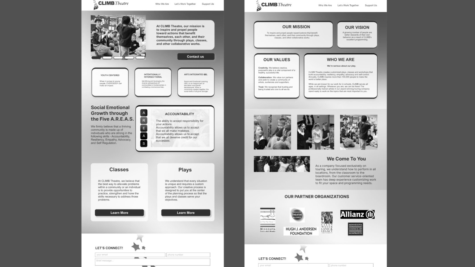
How to make a Rainbow
One main aspect of the current Climb website was the amount of colors they wanted. It was required to have all the colors of the rainbow in the design. Our approach to the challenge was to make it easier for the user to look at without being too overwhelming.
Challenges with the Rainbow template:
User becomes dizzy from looking at too many colors.
Color contrast is lacking when using yellow backgrounds and contributes to inconsistency.
Solution
To utilize all the colors, I designed a gradient background and overlapped darkened text - sometimes with a glass-textured background - along with images spread throughout the pages.
To keep consistency, our team re-used the gradient for every page. We also standardized the button aesthetics and limited our font types to only 2. Some wording on the pages were changed to help the users understand what to expect and fix some misspelling errors. We also placed a Contact Us button on the homepage to give a clear call-to-action and tell the user they need to contact Climb to get started. Additionally, we standardized the contact form in the footer rather than keeping the many variations the original website contained.
Although our wireframes differ greatly from the original website’s design, we ensured that the content placement remained the same.
FINDINGS AND RECOMMENDATIONS
Steps for the future
The Final Touch
We compiled our findings into a report along with recommendations of the changes we made and sent it to the client. You can view the report in the link.
Conclusion
Climb Theatre is looking to expand their business to new potential users through its website. To bring awareness of their vision and mission, I was tasked to work in a small team to resolve the issues users have with navigating their site and contacting them to get started. By garnering insights from potential users and fixing certain elements in the website, we believe our UX research and design strategies will help Climb Theatre reach out to clients outside the educational industry and incorporate mature audiences for their plays.
What I Learned
Managing Time and Productivity between interviews and designing.
How to maintain and stay within our project’s scope.
Compiling a recommendations report.
What’s Next/Future Possibilities
Split the IA Diagram into smaller, more digestable parts.
Testing our redesign with potential users.
Increase readability and simplifying the donations page.